In web design, color schemes are key. A study found that 90% of product choices are based on color. This shows how important colors are for keeping users interested.
Colors make a site look good and help users decide. About 85% of buying decisions are influenced by color. Web designers use color psychology to make sites emotionally appealing, which helps users connect with the brand.
Using unique colors for a brand can make it more memorable by up to 80%. This helps build loyalty. A well-chosen color scheme also makes users happy, which keeps them coming back. For example, changing a button’s color can boost sales by 187.4%.
So, picking the right colors is essential. It guides how users behave and can increase sales. Understanding color psychology is vital for web designers.
Understanding Color Psychology in Web Design
Color psychology is key in web design. It shows how colors affect our feelings and actions online. By knowing color psychology, designers can make websites that really connect with people, making them more effective.
What is Color Psychology?
Color psychology looks at how colors influence our emotions and actions. Each color has its own message and feeling. Designers use this to make websites that grab attention and build positive feelings.
For example, blue is trusted, so it’s used in finance and tech. Red, on the other hand, is exciting and urgent, perfect for online shopping.
The Impact of Colors on User Behavior
Colors greatly affect how we behave online. The right colors can increase sales and keep people on a site longer. Warm colors like red make us act fast, while cool colors like blue make us feel calm and reliable.
This knowledge helps designers guide users to take the actions they want.
Color Associations Across Different Industries
Colors have special meanings in different industries. They help create a sense of familiarity and trust. For example, green is linked to health and wellness, making us feel alive and fresh.
Legal fields often use muted colors for professionalism. The toy industry uses bright colors to excite and engage. Knowing these color meanings helps designers connect with their audience better.
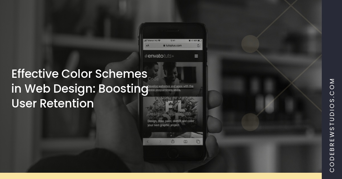
Effective Color Schemes in Web Design: Boosting User Retention
Effective color schemes are key to making a website look good. They help keep users interested and coming back. A site with nice colors makes visitors want to see more.
Knowing how colors make people feel is important. Web designers use this to make sites that people enjoy.
The Power of Visual Appeal
Colors can make us feel certain ways. Blue makes us calm, while red gets us excited. Choosing the right colors can make users want to explore more.
Studies show that 93% of people look at how something looks before buying. This shows how important colors are for a good first impression.
How Color Influences User Trust and Engagement
Colors can make users trust a site more. Blue is often used by companies to look professional. Using the same colors everywhere helps people remember the brand.
Research says 75% of people judge a company by its website. Using colors wisely, like for buttons, can make users more likely to act.
Best Practices for Choosing Colors
Choosing colors right is important. Using colors that stand out makes text easier to read. Keeping colors the same across all sites is also key.
Using colors that go well together makes a site look nice and easy to navigate. Tools like Color Hunt and Coolors help designers pick the right colors for any site.
Color Combinations That Enhance User Experience
Color combinations are key in web design, shaping user experience and engagement. The right color harmony can make interfaces both beautiful and engaging. For example, blue and orange together can make important elements pop without feeling too much.
High-contrast schemes are great for e-commerce sites. They make products stand out, helping everyone see important info, even those with visual issues.
Neutral tones like white, black, and gray give a sleek, professional vibe. A splash of color, like fuchsia and dark grey, can grab attention while keeping things classy. Knowing how colors affect emotions can also boost user happiness and interaction. Tools like Color Hunt or Coolors help designers create colors that match their brand.
Testing color combos with user feedback, like A/B testing, helps designers improve. Staying up-to-date with trends and keeping colors consistent with the brand builds trust. A well-chosen color scheme can greatly improve the user experience.