Typography is key in web design, affecting both how easy a site is to read and its look. It’s not just for looks; it’s a way to connect with users. Bad font choices can hide important info and make the site hard to use.
Good typography helps users navigate the site and understand the brand’s message. It’s all about choosing the right fonts. Sans-serif fonts like Arial are best for screens because they’re clear. Serif fonts, like Times New Roman, add a classic touch.
Designers should use no more than three fonts on a site. They must think about how each font affects the site’s look and feel. Paying attention to font size, line height, and color contrast makes the site more accessible and engaging.
Knowing about typography helps designers create sites that grab users’ attention and share the brand’s message well. It’s about choosing the right fonts and using space wisely. This makes a site that’s both beautiful and easy to use, keeping visitors interested and wanting to learn more.
The Importance of Typography in Web Design
Typography is key in making a website great. The right typeface can change how a website looks and works. It’s important to know how typography affects how people see and feel about a website.
The Role of Typeface Selection
Choosing the right typefaces is critical for a website’s personality. Serif fonts are formal and often used in schools or offices. Sans-serif fonts are modern and fit well in creative fields. This choice is vital for good typography in web design.
Creating a Visual Identity through Fonts
Typography helps create a unique look for a brand. Using the same fonts makes a brand more recognizable and trustworthy. A consistent typographic style tells the brand’s story and improves the user’s experience.
Typography’s Influence on Brand Perception
Typography greatly impacts how people see a brand. The right fonts can make a brand look credible and professional. So, typography not only makes a website look good but also shapes how customers view the brand.
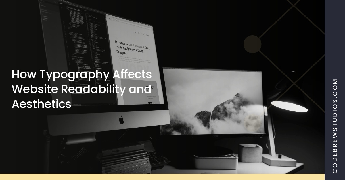
How Typography Affects Website Readability and Aesthetics
Typography is more than just looks; it’s key to making websites easy to read. It’s important to know the difference between legibility and readability. Legibility is about seeing individual characters clearly. Readability is about how well text flows together.
Finding the right balance between these two makes content easier to understand. It also keeps users interested in what they’re reading.
Legibility vs. Readability
In web design, both legibility and readability are very important. The right font size makes it easier to see letters and words. Readability gets a boost from proper line height, which adds space and prevents clutter.
A clear typographic hierarchy helps guide the reader. It makes the experience more intuitive and enjoyable.
The Impact of Font Size and Line Height on User Experience
Font size and line height greatly affect how users feel about a website. A 16px font size is often recommended for clear text. A line height of about 1.5 times the font size makes reading smooth and comfortable.
Good alignment and spacing enhance the look and feel of the site. They also make users more positive about the content.
Utilizing Color and Contrast for Better Accessibility
Color contrast is essential for making websites accessible. Using high contrast, like dark text on a light background, improves readability. Following accessibility guidelines helps meet the needs of users with visual impairments.
Using colors consistently not only makes the site look better. It also makes sure important information is accessible to everyone. This shows the importance of inclusivity in web design.
Best Practices for Effective Typography
Typography is key in web design, affecting both how users feel and how the site looks. Choosing the right fonts is a big step. It’s best to pick two or three fonts that work well together.
This keeps the design looking good and easy to read. Using fonts from the same family or with similar looks helps create a strong visual identity. This makes the site feel more cohesive and engaging to users.
Choosing Fonts that Complement Each Other
Think about the mood you want your website to have when picking fonts. Serif fonts, like Times New Roman, are professional and formal. They’re great for school or business sites.
Sans-serif fonts, like Helvetica, are modern and sleek. They’re perfect for trendy websites. Make sure to use the right font sizes. Headers should be big to grab attention, while subheadings and body text should be smaller for easy reading.
Avoiding Common Typography Mistakes
Stay away from typography mistakes that can make your site less engaging. Bad line spacing can make text hard to read. Aim for 50-75 characters per line and a line height of 125% of the font size for better readability.
Also, avoid too much capitalization and blinking text. These can distract users and make reading uncomfortable.
The Importance of Responsive Typography
In today’s world, responsive design is essential. Use flexible units like em and rem to make text resize well on different screens. This keeps the text clear and functional on all devices.
Media queries help adjust the typography for better reading on various devices. Make sure the contrast between text and background is at least 4.5:1. This ensures everyone, including those with vision problems, can see the text clearly.