In today’s digital world, responsive web design is key for smooth user experiences on many devices. With 77% of adults having a smartphone, businesses need to use adaptive design to stay ahead. Studies show that 94% of visitors judge a website by its responsive design.
This means websites must work well on all screen sizes, from phones to desktops. By using flexible grids, media queries, and responsive images, companies can improve user engagement and accessibility. This article will explore the importance of responsive web design, its best practices, and how it future-proofs websites in a changing tech world.
Understanding the Importance of Responsive Web Design
Responsive web design is key because more people use mobile devices to surf the internet. Now, over half of all website visits come from mobiles. This shows how vital it is for websites to work well on all screen sizes.
The Rise of Mobile Usage
Smartphones are getting more popular, and people expect websites to work well on them. Good design keeps visitors happy and can even help a site rank better in search results. Google likes mobile-friendly sites more.
Responsive design helps websites work better on all devices. This means more people can visit and enjoy your site. Key steps include:
- Using media queries and breakpoints to adjust styles for different devices.
- Choosing responsive images that change size based on the screen, making sites load faster.
- Creating flexible grids and fluid layouts to keep sites working on all devices.
Technology changes fast, so designers must keep up with new devices. Modern devices offer many features, making user experience even more important. Responsive design leads to happier users, fewer people leaving sites, and more sales. It’s a big part of the digital world today.
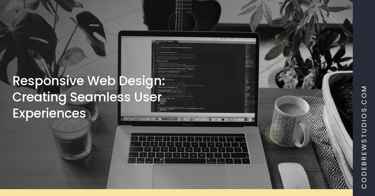
Responsive Web Design: Creating Seamless User Experiences
Responsive web design is key to better user engagement and accessibility. It makes websites adapt to different screen sizes. This design not only looks good but also keeps users on the site longer, boosting engagement.
Benefits for User Engagement
Websites with responsive design see big gains in user engagement. When users can easily find what they need, they’re happier. This leads to more time spent on the site.
The Boston Globe’s website makeover in 2011 is a great example. It made the site more engaging for readers.
Improved Accessibility
Responsive design makes websites more accessible. It ensures a smooth experience on all devices, helping users with disabilities. This focus on accessibility improves the overall user experience.
By making websites inclusive, responsive design benefits everyone. It creates a space where all users can easily find and interact with content.
Key Components of Responsive Web Design
Responsive web design is all about making websites easy to use. It uses flexible grids, media queries, and responsive images. These elements help websites look good and work well on many devices.
Flexible Grids and Layouts
Flexible grids are the heart of responsive web design. They use relative units like percentages, not fixed pixels. This lets elements resize with the screen, keeping layouts consistent across devices.
With more people shopping on their phones, this is very important. In the US, 82% of shoppers use smartphones to buy things.
Media Queries and CSS Techniques
Media queries are a key CSS technique. They let developers change styles based on screen size and resolution. By setting breakpoints, they create a website that changes as the environment does.
This makes sure users have a good experience, no matter how they access the web. It ensures all content looks right, no matter the device.
Responsive Images
Responsive images make websites better by changing size based on the screen. The “srcset” attribute helps pick the right image size. This keeps images looking great without slowing down the site.
With mobile shopping set to be 73% of online sales, good images are more important than ever. These design elements help websites adapt to every user, making for a better experience.


